How to create login form using HTML and CSS
Posted on May 20, 2021, 8 p.m. by Bishal ( 12992)
Hi Everyone, Code With Bishal is back with a new project. So grab your PC and open your favourite Code Editor and start coding with me. In this blog, we will create responsive login form using HTML and CSS. Login forms are very useful to help people login to your website. You can also use this form to create a registration form in your website.Continue reading this blog to take a demo of the login form. All the downloadable resources are attached to this blog, You can easily download these with the help of the buttons below.
What is a responsive login form?
Our awesome, responsive login form gives visitors attractive, and responsive login forms. So that you and your visitors can easily log in to your site.
How can I use this responsive login form?
You can easily copy the code or can download the code from our website and can simply paste it anywhere to get the responsive login form.
Do I need to know how to code?
No, you don't need to know how to code you can simply copy code from here and paste it wherever you want your responsive login form. Also, you can try it on our website using the "TRY IT NOW" option or can download the code using the "Download" button below.
What are the advantages of the responsive login form?
Responsive login form is a very good way for creating a login form that is mobile-friendly.
How can I download the source code of the responsive login form?
Scroll the page to the bottom there you will find our download button to download the code of our responsive login form.
In this blog, you can learn, how to make a responsive login form using HTML, CSS By Code With Bishal. Just Copy The Code From Here And Paste It Into Your Website or portfolio. To Preview scroll the page to the beginning. If you are having any problem viewing the code just refresh the page. The responsive login form is a lightweight and easy-to-use HTML, CSS code that creates a responsive login form for you. In this blog, there are fifth sections on the webpage, in the first section, you can get a preview of the blog, in the second section there are few FAQs and an overview of the blog, in the third section there are few more coding blogs you might like, in the fourth section you can Try our responsive login form using the "TRY IT NOW" button, after that, you can copy the code and paste it [that's the fifth section] and from the last section You can download the source code.
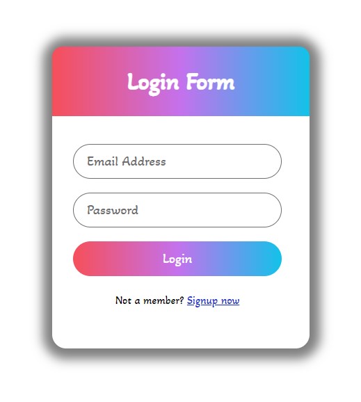
Some Screenshots
Demo
Login Form
Step by step guide of creating an responsive login form:
So this time I have something interesting you can put this where your clients or visitors will land or landing page and the visitors can login to the website easily using this login form (This is optimized for desktop as well as for mobile). The first step is to add the broiler plate of HTML, you can add this from below.
-
Create a file with the name
index.html -
Open
index.html -
Add the Broiler plate of HTML
Broiler Plate of HTML:
<!DOCTYPE html>
<html>
<head>
<title>Login Form - Code With Bishal</title>
</head>
<!-- created by Code With Bishal - www.codewithbishal.com
-->
<body>
</body>
</html>
After adding the broiler plate of HTML add the below code to to create some div containers.
<div class="wrapper">
<div class="form-title">
<div class="form-field">
<div class="link">
</div>
</div>
</div>
</div>
After adding the div now add the label and the input fields. Make sure to put them inside "form-field"
<input type="text" id="email" placeholder="Email Address" required>
<input type="password" id="password" placeholder="Email Address" required>
<input type="submit" value="Login" title="Login Now">
Now, let's add the CSS or style to our login form and this will do the styling of our form. So our second step is to add the CSS file, you can copy the code from below
-
Create a file
style.css -
Link External CSS file with your HTML file
Here is how can you link:
Add these code in the <head> </head> of your HTML document:
<link href="style.css" rel="stylesheet">
Now add some CSS code to the style.css file:
@import url('https://fonts.googleapis.com/css2?family=Akaya+Telivigala&display=swap');
*{
margin: 0;
padding: 0;
box-sizing: border-box;
font-family: 'Akaya Telivigala', sans-serif;
}
The below code will do the styling of the form.
.wrapper{
position: absolute;
top: 50%;
left: 50%;
transform: translate(-50%, -50%);
width: 370px;
border-radius: 20px;
box-shadow: 1px 1px 15px 15px rgba(0,0,0,0.5);
}
.wrapper > .form-title{
font-size: 35px;
font-weight: 600;
text-align: center;
line-height: 100px;
color:white;
user-select: none;
border-radius: 15px 15px 0 0;
background: #12c2e9;  /* fallback for old browsers */
background: -webkit-linear-gradient(to right, #f64f59, #c471ed, #12c2e9);
background: linear-gradient(to right, #f64f59, #c471ed, #12c2e9);
}
.wrapper > form{
padding: 20px 40px 60px 30px;
}
.wrapper > form > .form-field{
height: 50px;
width: 100%;
margin-top: 20px;
position: relative;
}
.wrapper > form .form-field > input{
height: 100%;
width: 100%;
outline: none;
font-size: 20px;
padding-left: 20px;
border: 1px solid rgb(110, 110, 110);
border-radius: 25px;
}
.wrapper > form .form-field > input:focus{
border-color: #1030d3;
}
.wrapper > form > .form-field label{
position: absolute;
top: 50%;
left: 20px;
color: #6d6d6d;
font-weight: 400;
font-size: 20px;
pointer-events: none;
transform: translateY(-50%);
}
form > .form-field > input:focus ~ label{
top: 0%;
font-size: 20px;
border-color: #052fff;
}
form > .form-field > input[type="submit"]{
color: #fff;
border: none;
padding-left: 0;
font-size: 20px;
font-weight: 500;
cursor: pointer;
background: #12c2e9;  /* fallback for old browsers */
background: -webkit-linear-gradient(to right, #f64f59, #c471ed, #12c2e9);
background: linear-gradient(to right, #f64f59, #c471ed, #12c2e9);
}
form > .form-field > input[type="submit"]:hover{
background: #12c2e9bd;  /* fallback for old browsers */
background: -webkit-linear-gradient(to right, #f64f5abb, #c471edb2, #12c2e9bd);
background: linear-gradient(to right, #f64f5abb, #c471edb2, #12c2e9bd);
transform: scale(1.11);
}
form > .link{
margin-top: 25px;
text-align: center;
}
form > .link a{
color: #132ecc;
}
Source Code
1) HTML Code:
<!DOCTYPE html>
<html>
<head>
<title>Login Form - Code With Bishal</title>
</head>
<!-- created by Code With Bishal - www.codewithbishal.com
-->
<body>
<div class="wrapper">
<div class="form-title">Login Form</div>
<form>
<div class="form-field">
<input type="text" id="email" placeholder="Email Address" required>
</div>
<div class="form-field">
<input type="password" id="password" placeholder="Password" required>
</div>
<div class="form-field">
<input type="submit" value="Login" title="Login Now">
</div>
<div class="link">Not a member? <a href="#" title="Sign up now">Signup now</a></div>
</form>
</div>
</body>
</html>
2) CSS Code:
@import url('https://fonts.googleapis.com/css2?family=Akaya+Telivigala&display=swap');
*{
margin: 0;
padding: 0;
box-sizing: border-box;
font-family: 'Akaya Telivigala', sans-serif;
}
.wrapper{
position: absolute;
top: 50%;
left: 50%;
transform: translate(-50%, -50%);
width: 370px;
border-radius: 20px;
box-shadow: 1px 1px 15px 15px rgba(0,0,0,0.5);
}
.wrapper > .form-title{
font-size: 35px;
font-weight: 600;
text-align: center;
line-height: 100px;
color:white;
user-select: none;
border-radius: 15px 15px 0 0;
background: #12c2e9;  /* fallback for old browsers */
background: -webkit-linear-gradient(to right, #f64f59, #c471ed, #12c2e9);
background: linear-gradient(to right, #f64f59, #c471ed, #12c2e9);
}
.wrapper > form{
padding: 20px 40px 60px 30px;
}
.wrapper > form > .form-field{
height: 50px;
width: 100%;
margin-top: 20px;
position: relative;
}
.wrapper > form .form-field > input{
height: 100%;
width: 100%;
outline: none;
font-size: 20px;
padding-left: 20px;
border: 1px solid rgb(110, 110, 110);
border-radius: 25px;
}
.wrapper > form .form-field > input:focus{
border-color: #1030d3;
}
.wrapper > form > .form-field label{
position: absolute;
top: 50%;
left: 20px;
color: #6d6d6d;
font-weight: 400;
font-size: 20px;
pointer-events: none;
transform: translateY(-50%);
}
form > .form-field > input:focus ~ label{
top: 0%;
font-size: 20px;
border-color: #052fff;
}
form > .form-field > input[type="submit"]{
color: #fff;
border: none;
padding-left: 0;
font-size: 20px;
font-weight: 500;
cursor: pointer;
background: #12c2e9;  /* fallback for old browsers */
background: -webkit-linear-gradient(to right, #f64f59, #c471ed, #12c2e9);
background: linear-gradient(to right, #f64f59, #c471ed, #12c2e9);
}
form > .form-field > input[type="submit"]:hover{
background: #12c2e9bd;  /* fallback for old browsers */
background: -webkit-linear-gradient(to right, #f64f5abb, #c471edb2, #12c2e9bd);
background: linear-gradient(to right, #f64f5abb, #c471edb2, #12c2e9bd);
transform: scale(1.11);
}
form > .link{
margin-top: 25px;
text-align: center;
}
form > .link a{
color: #132ecc;
}