Responsive Image gallery with hover effect
Posted on April 29, 2021, 8 p.m. by Bishal ( 5644)
This tutorial will show you how you can create a responsive image gallery with a CSS hover effect. The image gallery is made with a CSS grid and is fully responsive, this allows viewers to view this on any electronic device's screen such as mobile, Desktop, Laptop etc.
What is a Responsive Image gallery?
Our awesome, responsive Image gallery gives visitors an attractive and responsive Image gallery with CSS hover effect. You can also add these to your website or to your portfolio and can create a great impression in front of your visitors.
How can I use this responsive Image gallery using HTML and CSS?
You can easily copy the code or can download the code from our website and can simply paste it anywhere to get the responsive Image gallery.
Do I need to know how to code?
No, you don't need to know how to code you can simply copy the HTML and CSS code from here and paste it wherever you want your responsive Image gallery. Also, you can try it on our website using the "TRY IT NOW" option or can download the code using the "Download" button below.
Is it safe to use the responsive image gallery in HTML?
Yes, it's completely safe to use the responsive Image gallery.
What are the advantages of the responsive image gallery?
The responsive image gallery is a very good way for creating an image gallery.
How can I download the source code of the responsive image gallery?
Scroll the page to the bottom there you will find our download button to download the code.
In this blog, you can learn, how to make a responsive Image gallery using HTML and CSS By Code With Bishal. Just Copy The Code From Here And Paste It Into Your Website or portfolio. To Preview scroll the page to the beginning. If you are having any problem viewing the code just refresh the page. The responsive image gallery is a lightweight and easy-to-use HTML and CSS code that creates a responsive image gallery for you.
In this blog, there are fifth sections on the webpage, in the first section, you can get a preview of the blog, in the second section there are few FAQs and an overview of the blog, in the third section there are few more coding blogs you might like, in the fourth section you can Try our responsive Image gallery using the "TRY IT NOW" button, after that, you can copy the code and paste it [that's the fifth section] and from the last section You can download the source code.
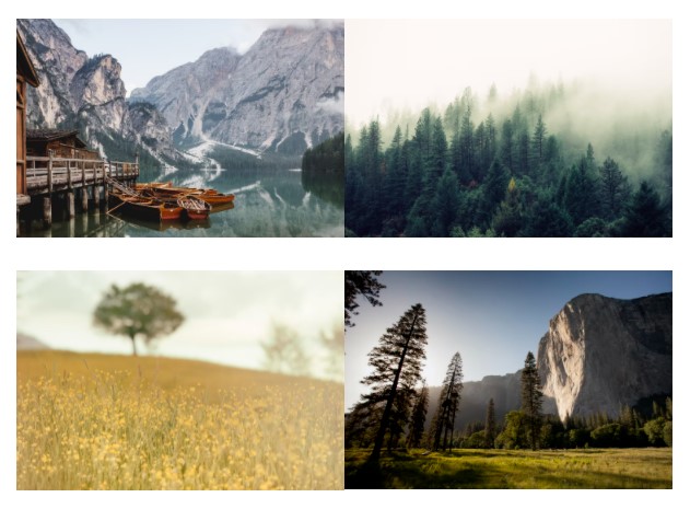
Some Screenshots
Demo


Step by step guide of creating a responsive Image gallery:
So this time I have something interesting you can put this where your clients or visitors will land or landing page of your portfolio and it will create an image gallery with CSS animation (This is optimized for desktop as well as for mobile). The first step is to add the broiler plate of HTML, you can add this from below.
-
Create a file with the name
index.html -
Open
index.html -
Add the Broiler plate of HTML
Broiler Plate of HTML:
<!DOCTYPE html>
<html>
<head>
<title>Responsive Gallery - Code With Bishal</title>
</head>
<!-- created by Code With Bishal - www.codewithbishal.com
-->
<body>
</body>
</html>
After adding the broiler plate of HTML, add the below code to create multiple containers.
<div class="wrapper1">
<div class="gallery">
</div>
</div>
Now, add another container and put images
<div class="image">
<span>
</span>
</div>
Now, let's add the CSS or style to our HTML file and this will do the styling of our Image Gallery. So our second step is to add the CSS file, you can copy the code from below.
-
Create a file
style.css -
Link External CSS file with your HTML file
Here is how can you link:
Add these code in the <head> </head> of your HTML document:
<link href="style.css" rel="stylesheet">
Now add some CSS code to the style.css file:
* {
margin: 0%;
padding: 0%;
box-sizing: border-box;
}
.gallery {
display: grid;
grid-template-columns: repeat(auto-fill, 300px);
justify-content: center;
}
We will make our gallery responsive using display:grid;
We have successfully made our gallery responsive. Now insert the below code to add the hover effect.
.gallery img {
width: 100%;
}
.gallery img:hover {
  opacity: 0.7;
}
Source Code
1) HTML Code:
<!DOCTYPE html>
<html>
<head>
<title>Responsive Gallery - Code With Bishal</title>
</head>
<!-- created by Code With Bishal - www.codewithbishal.com
-->
<body>
<div class="wrapper">
<div class="gallery">
<div class="image">
<span><img
src="https://images.unsplash.com/photo-1470770903676-69b98201ea1c?ixid=MXwxMjA3fDB8MHxwaG90by1wYWdlfHx8fGVufDB8fHw%3D&ixlib=rb-1.2.1&auto=format&fit=crop&w=750&q=80"
alt="Image 1" /></span>
</div>
<div class="image">
<span><img
src="https://images.unsplash.com/photo-1418065460487-3e41a6c84dc5?ixid=MXwxMjA3fDB8MHxwaG90by1wYWdlfHx8fGVufDB8fHw%3D&ixlib=rb-1.2.1&auto=format&fit=crop&w=840&q=80"
alt="Image 2" /></span>
</div>
<div class="image">
<span><img
src="https://images.unsplash.com/reserve/HgZuGu3gSD6db21T3lxm_San%20Zenone.jpg?ixid=MXwxMjA3fDB8MHxwaG90by1wYWdlfHx8fGVufDB8fHw%3D&ixlib=rb-1.2.1&auto=format&fit=crop&w=840&q=80"
alt="Image 3" /></span>
</div>
<div class="image">
<span><img
src="https://images.unsplash.com/photo-1426604966848-d7adac402bff?ixid=MXwxMjA3fDB8MHxwaG90by1wYWdlfHx8fGVufDB8fHw%3D&ixlib=rb-1.2.1&auto=format&fit=crop&w=750&q=80"
alt="Image 4" /></span>
</div>
<div class="image">
<span><img
src="https://images.unsplash.com/photo-1588392382834-a891154bca4d?ixid=MXwxMjA3fDB8MHxwaG90by1wYWdlfHx8fGVufDB8fHw%3D&ixlib=rb-1.2.1&auto=format&fit=crop&w=755&q=80"
alt="Image 5" /></span>
</div>
<div class="image">
<span><img
src="https://images.unsplash.com/photo-1505765050516-f72dcac9c60e?ixid=MXwxMjA3fDB8MHxwaG90by1wYWdlfHx8fGVufDB8fHw%3D&ixlib=rb-1.2.1&auto=format&fit=crop&w=750&q=80"
alt="Image 6" /></span>
</div>
</div>
</div>
</body>
</html>
2) CSS Code:
* {
margin: 0%;
padding: 0%;
box-sizing: border-box;
}
.gallery {
  display: grid;
  grid-template-columns: repeat(auto-fill, 300px);
  justify-content: center;
}
.gallery img {
  width: 100%;
}
.gallery img:hover {
  opacity: 0.7;
}